
By Saeed Mirshekari
March 25, 2023
![]()
What Happened?
The COVID-19 pandemic has affected every aspect of life around the world since it first emerged in late 2019. As of March 2023, the virus has infected over 462 million people and caused over 6 million deaths worldwide. One of the ways that we have been able to monitor and track the spread of the virus has been through the use of statistics and data analysis, often with the help of programming languages like Python.
Simple Plots
Python is a powerful programming language that is widely used in data analysis and scientific computing. It has a rich ecosystem of libraries and tools that make it well-suited to working with large datasets, including those related to the COVID-19 pandemic. In this blog post, we'll explore some of the statistics of the pandemic and how we have used Python to monitor and understand the numbers.
The first statistic that is often reported in relation to COVID-19 is the number of cases. This refers to the number of people who have tested positive for the virus. In Python, we can use libraries like Pandas and Matplotlib to visualize the trend of cases over time. For example, the following code snippet loads data from the Our World in Data project and plots the cumulative number of cases worldwide:
import pandas as pd
import matplotlib.pyplot as plt

data = pd.read_csv("https://covid.ourworldindata.org/data/owid-covid-data.csv")
worldwide = data.groupby("date")["total_cases"].sum()
plt.plot(worldwide.index, worldwide.values)
plt.xlabel("Date")
plt.ylabel("Total Cases")
plt.show()
This produces a graph that shows the exponential growth of COVID-19 cases worldwide from early 2020 until the present day. We can also break down the data by country or region to see how the pandemic has affected different parts of the world.
Another important statistic is the number of deaths caused by COVID-19. In Python, we can use similar techniques to visualize the trend of deaths over time. For example, the following code snippet plots the cumulative number of deaths worldwide:
deaths = data.groupby("date")\["total_deaths"].sum()
plt.plot(deaths.index, deaths.values)
plt.xlabel("Date")
plt.ylabel("Total Deaths")
plt.show()
This produces a graph that shows how the number of deaths has increased as the pandemic has progressed.
Advanced Plots: By Country
Beyond just tracking the raw numbers of cases and deaths, statisticians have also used Python to analyze other factors that contribute to the spread of the virus. For example, we can use statistical modeling techniques to estimate the reproductive rate of the virus, which tells us how many people an infected person is likely to spread the virus to. This information can be used to predict how quickly the virus is likely to spread and to inform public health policies.
How Deadly Was COVID in Each Country Over Time?
We looked at a small pool of major countries including US, China, India, Russia, United Kingdom, Germany, France and Iran and got the most recent data from reliable sources. No source is 100% accurate. In fact, there is evidences that some are very inaccurate. But anyways... That's all data we have recorded...
Then we asked this question: How deadly was the pandemic in each country over time? We monitored this via the Mortality Rate/ But what is mortality rate? Mortality rate is the number of death divided by the number of confirmed cases.
Check out the result plot below. From this plot it looks like the most critical period of the pandemic has been the first 100 days in which the mortality rate reached to its peak! After 200 days the mortality rate drops and becomes stable from that point.
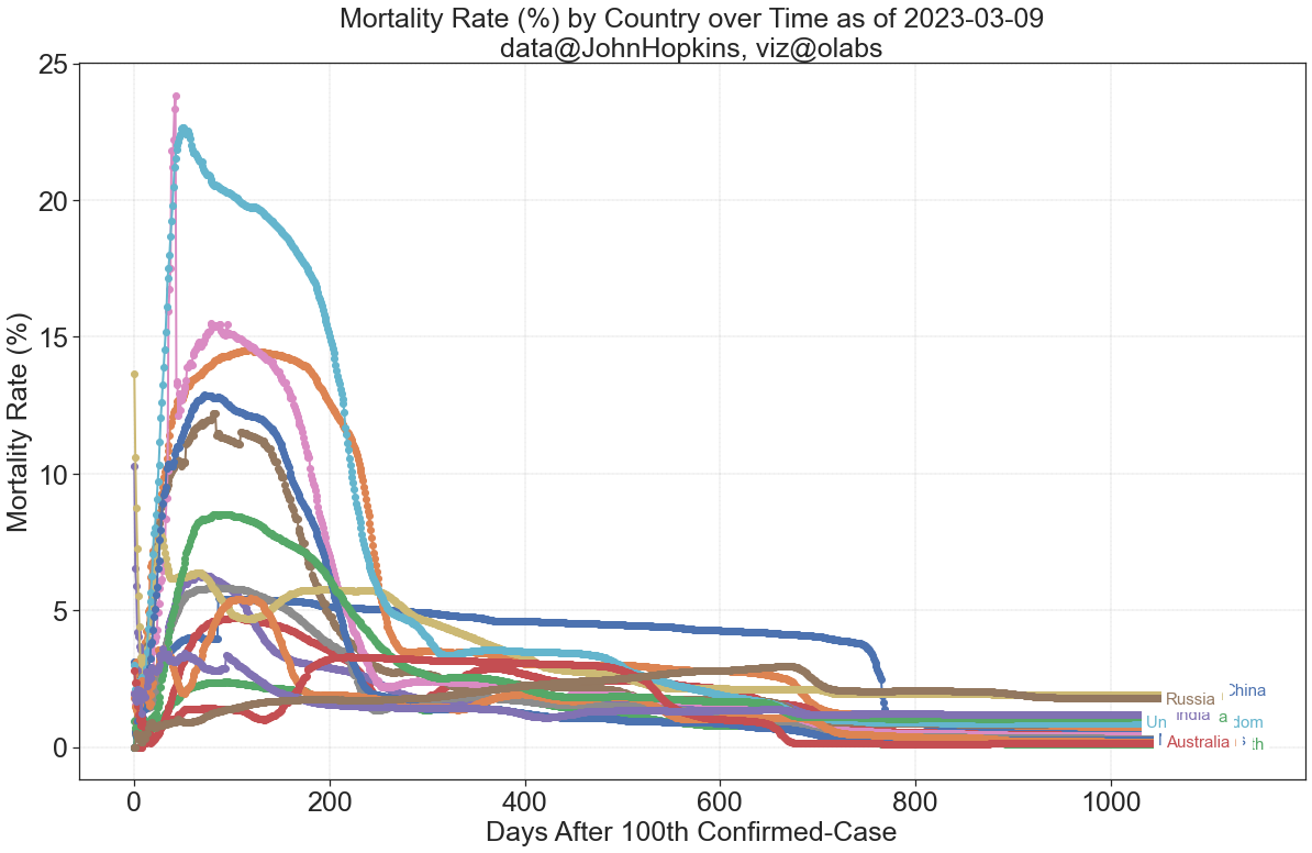
In some countries the mortality rate have reached beyond 20% very quickly. That means from every 100 confirmed cases more than 20 people were dying because of the virus at the earlier stages of the pandemic.
Even though the mortality rate is quite different in the early stages for each country, it all merges into a similar rate of 2-3% after about 2 years for all the countries. Of course different countries managed the situation differently and it is visible in this data. The Light Blue curve represents the United Kingdom.
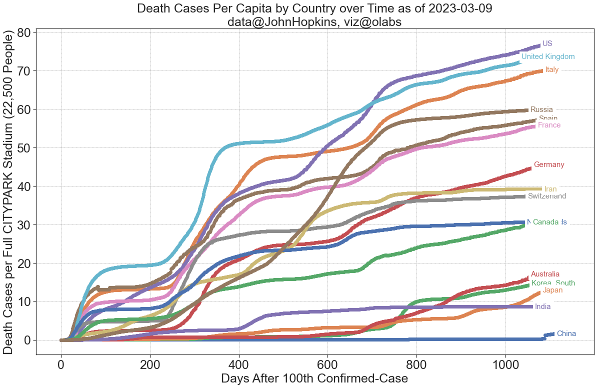
Which Countries Lost More People Per Capita by COVID?
The second question I wanted to answer through this data was: How badly each country got affected by the virus? In particular, if I have a huge crowd of people, let say a full soccer stadium, for example The CityPark in St. Louis with 22,500 seats, how many dies in each country because of COVID-19?
To help you imagine the size of the crowd of 22,000 people, here is a photo of the CityPark stadium in St. Louis:

Now let see if we monitor a sample of people with the same size of the City Park stadium in each country, how many we have lost over time? The results shows US and UK have lost pretty significantly and China's numbers are unbelievably low when you take the populations into the account.
Below you can find the full code for creating the plots above.
The Code for The Plots
Conclusion
In conclusion, Python and statistics have been critical tools in monitoring and understanding the COVID-19 pandemic. By visualizing the trends in cases and deaths, and by analyzing other factors that contribute to the spread of the virus, we have been able to develop a clearer picture of the impact of the pandemic around the world.
While the pandemic has been a difficult and challenging time for many people, the insights gained from statistical analysis will be valuable for informing public health policies and preparing for future outbreaks

Saeed Mirshekari
Saeed is currently a Director of Data Science in Mastercard and the Founder / Director of OFallon Labs LLC. He is a former research scholar at LIGO team (Physics Nobel Prize of 2017).